Lecture 12 (4/22/2022)
Announcements
Last time we covered:
Tidy data (wide / long format)
Today’s agenda:
Data transformations
Part 1: logarithmic transformations
Part 2: z-scoring
import numpy as np
import pandas as pd
import matplotlib.pyplot as plt
import seaborn as sns
Part 1: log transformations
Problem: highly skewed data
To get a sense of when we may need to transform our data, let’s take a look at our gapminder dataset once again:
gap = pd.read_csv("https://raw.githubusercontent.com/UCSD-CSS-002/ucsd-css-002.github.io/master/datasets/gapminder.csv")

gap
| Unnamed: 0 | country | continent | year | lifeExp | pop | gdpPercap | |
|---|---|---|---|---|---|---|---|
| 0 | 1 | Afghanistan | Asia | 1952 | 28.801 | 8425333 | 779.445314 |
| 1 | 2 | Afghanistan | Asia | 1957 | 30.332 | 9240934 | 820.853030 |
| 2 | 3 | Afghanistan | Asia | 1962 | 31.997 | 10267083 | 853.100710 |
| 3 | 4 | Afghanistan | Asia | 1967 | 34.020 | 11537966 | 836.197138 |
| 4 | 5 | Afghanistan | Asia | 1972 | 36.088 | 13079460 | 739.981106 |
| ... | ... | ... | ... | ... | ... | ... | ... |
| 1699 | 1700 | Zimbabwe | Africa | 1987 | 62.351 | 9216418 | 706.157306 |
| 1700 | 1701 | Zimbabwe | Africa | 1992 | 60.377 | 10704340 | 693.420786 |
| 1701 | 1702 | Zimbabwe | Africa | 1997 | 46.809 | 11404948 | 792.449960 |
| 1702 | 1703 | Zimbabwe | Africa | 2002 | 39.989 | 11926563 | 672.038623 |
| 1703 | 1704 | Zimbabwe | Africa | 2007 | 43.487 | 12311143 | 469.709298 |
1704 rows × 7 columns
Below we plot the distribution of population across the countries in this dataset for the most recent year available.
What does it look like?
g = sns.histplot(
    data = gap[gap["year"] == 2007],
    x = "pop",
    bins = 20 # even with more bins the distribution is similar
)
g.set_xlabel("Population (billions)")
g.set_title("Population by country, 2007")
Text(0.5, 1.0, 'Population by country, 2007')
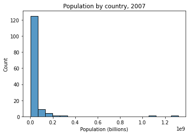
# How skewed is the data above?

gap["pop"][gap["year"] == 2007].mean() # ~44M
gap["pop"][gap["year"] == 2007].median() # ~10.5M


# ...big difference
10517531.0
Why this is a problem?
Most standard statistics assumes that the variables being predicted or serving as predictors are (roughly) normally distributed. Our population data above clearly isn’t!
How common is this?
The pattern above isn’t unique to population. Many other common variables tend to have similarly shaped distributions.
Can you think of some others? (hint: remember Zipf’s Law back in pset 1?)
Solution: with skewed data, use log transform!
What do we mean by log transforming?
We want to convert our population data to a logarithmic scale rather than a linear scale.
We’ll illustrate this difference below.
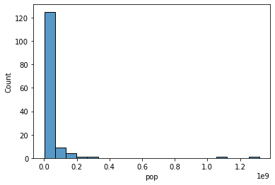
# Our original graph used bins scaled at a linear interval. We're printing them below.

_ = sns.histplot(
    data = gap[gap["year"] == 2007],
    x = "pop",
    bins = 20
)

# Here's our original histogram bins: note how they increase by a fixed amount
print("Histogram bins: {}".format([str(elem) for elem in plt.xticks()[0]]))

# Can print each element minus the previous elemnt to show this
# [plt.xticks()[0][i+1] - plt.xticks()[0][i] for i in range(len(plt.xticks()[0])-1)]
Histogram bins: ['-200000000.0', '0.0', '200000000.0', '400000000.0', '600000000.0', '800000000.0', '1000000000.0', '1200000000.0', '1400000000.0']
# Step 1: let's generate logarithmic scaled bins instead of the above.


# Instead of increasing by a fixed amount (200k), they will increase by a fixed *multiple* (10) from 100k to 1B
# Use `np.logspace` for this
log_bins = np.logspace(base = 10, # specify the base (10 is default)
                       start = 5, # specify the start, which is base**start (in this case 10e5)
                       stop = 9, # specify the end, which is base**end (in this case 10e9)
                       num = 10) # specify the number of bins

[str(elem) for elem in log_bins]

# These don't increase by a fixed amount
# Can print each element minus the previous element as we did above to show this

# [log_bins[i+1] - log_bins[i] for i in range(len(log_bins)-1)]

# Instead, they increase by a fixed *multiple*
# Can print each element in log_bins *divided by* the previous element to show this

# [log_bins[i+1] / log_bins[i] for i in range(len(log_bins)-1)]
['100000.0',
 '278255.94022071257',
 '774263.6826811278',
 '2154434.6900318824',
 '5994842.503189409',
 '16681005.372000592',
 '46415888.33612773',
 '129154966.50148827',
 '359381366.3804626',
 '1000000000.0']
# Now, let's use these logarithmic intervals as the basis for our histogram bins

g = sns.histplot(
    data = gap[gap["year"] == 2007],
    x = "pop",
    bins = log_bins # This is the key change
)

# NOTE: we need to also specify that the x axis should be drawn on a logarithmic scale
# (try graphing without this to see what happens!)
g.set_xscale('log')
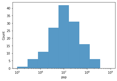
Our data looks normally distributed when we plot it on a log scale. Woo hoo!
But we haven’t changed the underlying data.
Let’s log transform the data itself so its (log) values are normally distributed.
# To do this, use np.log10 (np.log uses the *natural log*)
gap['log_pop'] = np.log10(gap['pop'])

gap
| Unnamed: 0 | country | continent | year | lifeExp | pop | gdpPercap | log_pop | |
|---|---|---|---|---|---|---|---|---|
| 0 | 1 | Afghanistan | Asia | 1952 | 28.801 | 8425333 | 779.445314 | 6.925587 |
| 1 | 2 | Afghanistan | Asia | 1957 | 30.332 | 9240934 | 820.853030 | 6.965716 |
| 2 | 3 | Afghanistan | Asia | 1962 | 31.997 | 10267083 | 853.100710 | 7.011447 |
| 3 | 4 | Afghanistan | Asia | 1967 | 34.020 | 11537966 | 836.197138 | 7.062129 |
| 4 | 5 | Afghanistan | Asia | 1972 | 36.088 | 13079460 | 739.981106 | 7.116590 |
| ... | ... | ... | ... | ... | ... | ... | ... | ... |
| 1699 | 1700 | Zimbabwe | Africa | 1987 | 62.351 | 9216418 | 706.157306 | 6.964562 |
| 1700 | 1701 | Zimbabwe | Africa | 1992 | 60.377 | 10704340 | 693.420786 | 7.029560 |
| 1701 | 1702 | Zimbabwe | Africa | 1997 | 46.809 | 11404948 | 792.449960 | 7.057093 |
| 1702 | 1703 | Zimbabwe | Africa | 2002 | 39.989 | 11926563 | 672.038623 | 7.076515 |
| 1703 | 1704 | Zimbabwe | Africa | 2007 | 43.487 | 12311143 | 469.709298 | 7.090298 |
1704 rows × 8 columns
Now what? Let’s take a look at our log transformed population variable.
Is it normally distributed?
g = sns.histplot(data = gap[gap['year'] == 2007], x = 'log_pop')
g.set_xlabel("Log transformed population")
Text(0.5, 0, 'Log transformed population')
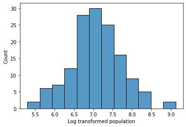
Log transformations: Summary
Statistics and modeling solutions often assume that the underlying variables are normally distributed
You can count on many variables in the world being roughly normally distributed (especially with large samples!)
But certain types of data are reliably not normally distributed (ex. income, wealth, population, number of Twitter followers, number of Spotify streams, …)
When your data looks like the examples above (rule of thumb: roughly exponentially distributed, or has very large right skew), it’s often the case that the logarithm of the data is normally distributed.
You can check whether this is true by plotting it on a log scale as we did above. If so, consider log transforming your data.
Note: using the log transformed values for a variable in statistics or regression changes how you interpret your results (for example, regression coefficients on a log-transformed variable X will reflect the impact of multiplicative changes to X on the output variable Y).
Part 2: z-scoring
Problem: comparing data from different distributions
To get a sense of when we may need to z-score our data, let’s take a look at our pokemon dataset once again:
pk = pd.read_csv("https://raw.githubusercontent.com/UCSD-CSS-002/ucsd-css-002.github.io/master/datasets/Pokemon.csv")

pk
| # | Name | Type 1 | Type 2 | Total | HP | Attack | Defense | Sp. Atk | Sp. Def | Speed | Generation | Legendary | |
|---|---|---|---|---|---|---|---|---|---|---|---|---|---|
| 0 | 1 | Bulbasaur | Grass | Poison | 318 | 45 | 49 | 49 | 65 | 65 | 45 | 1 | False |
| 1 | 2 | Ivysaur | Grass | Poison | 405 | 60 | 62 | 63 | 80 | 80 | 60 | 1 | False |
| 2 | 3 | Venusaur | Grass | Poison | 525 | 80 | 82 | 83 | 100 | 100 | 80 | 1 | False |
| 3 | 3 | VenusaurMega Venusaur | Grass | Poison | 625 | 80 | 100 | 123 | 122 | 120 | 80 | 1 | False |
| 4 | 4 | Charmander | Fire | NaN | 309 | 39 | 52 | 43 | 60 | 50 | 65 | 1 | False |
| ... | ... | ... | ... | ... | ... | ... | ... | ... | ... | ... | ... | ... | ... |
| 795 | 719 | Diancie | Rock | Fairy | 600 | 50 | 100 | 150 | 100 | 150 | 50 | 6 | True |
| 796 | 719 | DiancieMega Diancie | Rock | Fairy | 700 | 50 | 160 | 110 | 160 | 110 | 110 | 6 | True |
| 797 | 720 | HoopaHoopa Confined | Psychic | Ghost | 600 | 80 | 110 | 60 | 150 | 130 | 70 | 6 | True |
| 798 | 720 | HoopaHoopa Unbound | Psychic | Dark | 680 | 80 | 160 | 60 | 170 | 130 | 80 | 6 | True |
| 799 | 721 | Volcanion | Fire | Water | 600 | 80 | 110 | 120 | 130 | 90 | 70 | 6 | True |
800 rows × 13 columns
Let’s say we want to know whether each of our pokemon is going to be better off attacking opponents, or simply outlasting them.
The Attack variable indicates how strong they are at attacking, while HP indicates how long they can withstand attacks.
How would we evaluate which of these is stronger for each pokemon?
Strategy 1: look at which variable is larger
# "attacker" variable says whether a given pokemon has higher attack value than HP
pk['attacker'] = pk['Attack'] > pk['HP']

pk
| # | Name | Type 1 | Type 2 | Total | HP | Attack | Defense | Sp. Atk | Sp. Def | Speed | Generation | Legendary | attacker | |
|---|---|---|---|---|---|---|---|---|---|---|---|---|---|---|
| 0 | 1 | Bulbasaur | Grass | Poison | 318 | 45 | 49 | 49 | 65 | 65 | 45 | 1 | False | True |
| 1 | 2 | Ivysaur | Grass | Poison | 405 | 60 | 62 | 63 | 80 | 80 | 60 | 1 | False | True |
| 2 | 3 | Venusaur | Grass | Poison | 525 | 80 | 82 | 83 | 100 | 100 | 80 | 1 | False | True |
| 3 | 3 | VenusaurMega Venusaur | Grass | Poison | 625 | 80 | 100 | 123 | 122 | 120 | 80 | 1 | False | True |
| 4 | 4 | Charmander | Fire | NaN | 309 | 39 | 52 | 43 | 60 | 50 | 65 | 1 | False | True |
| ... | ... | ... | ... | ... | ... | ... | ... | ... | ... | ... | ... | ... | ... | ... |
| 795 | 719 | Diancie | Rock | Fairy | 600 | 50 | 100 | 150 | 100 | 150 | 50 | 6 | True | True |
| 796 | 719 | DiancieMega Diancie | Rock | Fairy | 700 | 50 | 160 | 110 | 160 | 110 | 110 | 6 | True | True |
| 797 | 720 | HoopaHoopa Confined | Psychic | Ghost | 600 | 80 | 110 | 60 | 150 | 130 | 70 | 6 | True | True |
| 798 | 720 | HoopaHoopa Unbound | Psychic | Dark | 680 | 80 | 160 | 60 | 170 | 130 | 80 | 6 | True | True |
| 799 | 721 | Volcanion | Fire | Water | 600 | 80 | 110 | 120 | 130 | 90 | 70 | 6 | True | True |
800 rows × 14 columns
# We can plot this variable across our generations
sns.countplot(data = pk,
              x = 'Generation',
              hue = 'attacker'
             )
<AxesSubplot:xlabel='Generation', ylabel='count'>
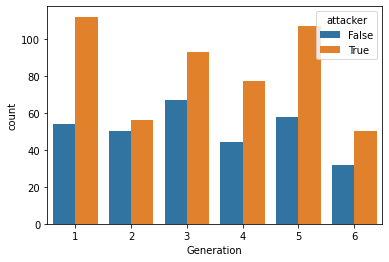
However, there’s one challenge with this strategy.
If many pokemon have higher Attack than HP values, we can’t always tell whether a pokemon has a greater advantage when attacking or withstanding an opponent by just looking at which value is higher.
To see this, take a look at the distribution of HP and Attack variables below.
# For the graph below, it's easiest to switch to tidy data!

pk_tidy = pk.melt(
    id_vars = ["#", "Name", "Type 1", "Type 2", "Generation", "Legendary", "attacker"]
)
pk_tidy


sns.histplot(
    data = pk_tidy[pk_tidy['variable'].isin(["HP", "Attack"])],
    x = "value",
    hue = "variable",
    kde = True,
    bins = 15
)
<AxesSubplot:xlabel='value', ylabel='Count'>
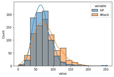
In the graph above, the Attack distribution is shifted right and seems more spread out than the HP distribution, so most pokemon will likely have higher Attack points.
What we really want to know might be something like: relative to the competition, does each pokemon have a more impressive Attack or HP value?
Solution: when comparing across (normal) distributions, try z-scores!
What is a z-score?
A z-score for a given observation \(x\) is the number of standard deviations away from the mean it is.
\(Z = \dfrac{x - \mu}{\sigma}\)
# Let's pre-compute the mean and standard deviation of each distribution in our data (Attack and HP)

mean_attack = pk['Attack'].mean() # 79
mean_hp = pk['HP'].mean() # 69

sd_attack = pk['Attack'].std() # 32.5
sd_hp = pk['HP'].std() # 25.5

# Note that these are fairly different in roughly the way we described above.
# Now, let's evaluate the z score for each pokemon's Attack and HP values

pk['attack_z'] = (pk['Attack'] - mean_attack) / sd_attack
pk['hp_z'] = (pk['HP'] - mean_hp) / sd_hp

pk
| # | Name | Type 1 | Type 2 | Total | HP | Attack | Defense | Sp. Atk | Sp. Def | Speed | Generation | Legendary | attacker | attack_z | hp_z | |
|---|---|---|---|---|---|---|---|---|---|---|---|---|---|---|---|---|
| 0 | 1 | Bulbasaur | Grass | Poison | 318 | 45 | 49 | 49 | 65 | 65 | 45 | 1 | False | True | -0.924328 | -0.950032 |
| 1 | 2 | Ivysaur | Grass | Poison | 405 | 60 | 62 | 63 | 80 | 80 | 60 | 1 | False | True | -0.523803 | -0.362595 |
| 2 | 3 | Venusaur | Grass | Poison | 525 | 80 | 82 | 83 | 100 | 100 | 80 | 1 | False | True | 0.092390 | 0.420654 |
| 3 | 3 | VenusaurMega Venusaur | Grass | Poison | 625 | 80 | 100 | 123 | 122 | 120 | 80 | 1 | False | True | 0.646964 | 0.420654 |
| 4 | 4 | Charmander | Fire | NaN | 309 | 39 | 52 | 43 | 60 | 50 | 65 | 1 | False | True | -0.831899 | -1.185007 |
| ... | ... | ... | ... | ... | ... | ... | ... | ... | ... | ... | ... | ... | ... | ... | ... | ... |
| 795 | 719 | Diancie | Rock | Fairy | 600 | 50 | 100 | 150 | 100 | 150 | 50 | 6 | True | True | 0.646964 | -0.754220 |
| 796 | 719 | DiancieMega Diancie | Rock | Fairy | 700 | 50 | 160 | 110 | 160 | 110 | 110 | 6 | True | True | 2.495543 | -0.754220 |
| 797 | 720 | HoopaHoopa Confined | Psychic | Ghost | 600 | 80 | 110 | 60 | 150 | 130 | 70 | 6 | True | True | 0.955061 | 0.420654 |
| 798 | 720 | HoopaHoopa Unbound | Psychic | Dark | 680 | 80 | 160 | 60 | 170 | 130 | 80 | 6 | True | True | 2.495543 | 0.420654 |
| 799 | 721 | Volcanion | Fire | Water | 600 | 80 | 110 | 120 | 130 | 90 | 70 | 6 | True | True | 0.955061 | 0.420654 |
800 rows × 16 columns
What do z-score distributions look like?
sns.kdeplot(data = pk, x = 'attack_z', color = 'red', alpha = 0.5)
sns.kdeplot(data = pk, x = 'hp_z', color = 'green', alpha = 0.5)

plt.xlabel("Z score")
Text(0.5, 0, 'Z score')
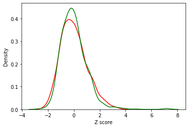
These are much more comparable!
Now, we can ask which pokemon have a higher z-scored Attack relative to their z-scored HP
pk['z_attacker'] = pk['attack_z'] > pk['hp_z']

pk
| # | Name | Type 1 | Type 2 | Total | HP | Attack | Defense | Sp. Atk | Sp. Def | Speed | Generation | Legendary | attacker | attack_z | hp_z | z_attacker | |
|---|---|---|---|---|---|---|---|---|---|---|---|---|---|---|---|---|---|
| 0 | 1 | Bulbasaur | Grass | Poison | 318 | 45 | 49 | 49 | 65 | 65 | 45 | 1 | False | True | -0.924328 | -0.950032 | True |
| 1 | 2 | Ivysaur | Grass | Poison | 405 | 60 | 62 | 63 | 80 | 80 | 60 | 1 | False | True | -0.523803 | -0.362595 | False |
| 2 | 3 | Venusaur | Grass | Poison | 525 | 80 | 82 | 83 | 100 | 100 | 80 | 1 | False | True | 0.092390 | 0.420654 | False |
| 3 | 3 | VenusaurMega Venusaur | Grass | Poison | 625 | 80 | 100 | 123 | 122 | 120 | 80 | 1 | False | True | 0.646964 | 0.420654 | True |
| 4 | 4 | Charmander | Fire | NaN | 309 | 39 | 52 | 43 | 60 | 50 | 65 | 1 | False | True | -0.831899 | -1.185007 | True |
| ... | ... | ... | ... | ... | ... | ... | ... | ... | ... | ... | ... | ... | ... | ... | ... | ... | ... |
| 795 | 719 | Diancie | Rock | Fairy | 600 | 50 | 100 | 150 | 100 | 150 | 50 | 6 | True | True | 0.646964 | -0.754220 | True |
| 796 | 719 | DiancieMega Diancie | Rock | Fairy | 700 | 50 | 160 | 110 | 160 | 110 | 110 | 6 | True | True | 2.495543 | -0.754220 | True |
| 797 | 720 | HoopaHoopa Confined | Psychic | Ghost | 600 | 80 | 110 | 60 | 150 | 130 | 70 | 6 | True | True | 0.955061 | 0.420654 | True |
| 798 | 720 | HoopaHoopa Unbound | Psychic | Dark | 680 | 80 | 160 | 60 | 170 | 130 | 80 | 6 | True | True | 2.495543 | 0.420654 | True |
| 799 | 721 | Volcanion | Fire | Water | 600 | 80 | 110 | 120 | 130 | 90 | 70 | 6 | True | True | 0.955061 | 0.420654 | True |
800 rows × 17 columns
# We can plot this variable across our generations
sns.countplot(data = pk,
              x = 'Generation',
              hue = 'z_attacker'
             )

# Note it's a little less dramatic than our previous plot!
<AxesSubplot:xlabel='Generation', ylabel='count'>
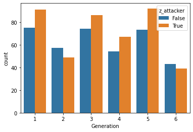
This plot provides a little more balanced picture than our previous one.
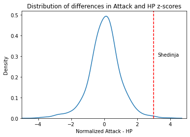
We can also use the z-scores to compare each pokemon’s Attack and HP in a more fine-grained way:
# Let's see which pokemon have the largest difference (in standard deviation units) between their `Attack` and `HP`
pk['attack_diff_normalized'] = pk['attack_z'] - pk['hp_z']

pk.nlargest(10, 'attack_diff_normalized')
| # | Name | Type 1 | Type 2 | Total | HP | Attack | Defense | Sp. Atk | Sp. Def | Speed | Generation | Legendary | attacker | attack_z | hp_z | z_attacker | attack_diff_normalized | |
|---|---|---|---|---|---|---|---|---|---|---|---|---|---|---|---|---|---|---|
| 429 | 386 | DeoxysAttack Forme | Psychic | NaN | 600 | 50 | 180 | 20 | 180 | 20 | 150 | 3 | True | True | 3.111736 | -0.754220 | True | 3.865956 |
| 796 | 719 | DiancieMega Diancie | Rock | Fairy | 700 | 50 | 160 | 110 | 160 | 110 | 110 | 6 | True | True | 2.495543 | -0.754220 | True | 3.249763 |
| 316 | 292 | Shedinja | Bug | Ghost | 236 | 1 | 90 | 45 | 30 | 30 | 40 | 3 | False | True | 0.338868 | -2.673179 | True | 3.012047 |
| 428 | 386 | DeoxysNormal Forme | Psychic | NaN | 600 | 50 | 150 | 50 | 150 | 50 | 150 | 3 | True | True | 2.187446 | -0.754220 | True | 2.941666 |
| 387 | 354 | BanetteMega Banette | Ghost | NaN | 555 | 64 | 165 | 75 | 93 | 83 | 75 | 3 | False | True | 2.649591 | -0.205945 | True | 2.855537 |
| 232 | 214 | HeracrossMega Heracross | Bug | Fighting | 600 | 80 | 185 | 115 | 40 | 105 | 75 | 2 | False | True | 3.265784 | 0.420654 | True | 2.845131 |
| 527 | 475 | GalladeMega Gallade | Psychic | Fighting | 618 | 68 | 165 | 95 | 65 | 115 | 110 | 4 | False | True | 2.649591 | -0.049296 | True | 2.698887 |
| 750 | 681 | AegislashBlade Forme | Steel | Ghost | 520 | 60 | 150 | 50 | 150 | 50 | 60 | 6 | False | True | 2.187446 | -0.362595 | True | 2.550042 |
| 137 | 127 | PinsirMega Pinsir | Bug | Flying | 600 | 65 | 155 | 120 | 65 | 90 | 105 | 1 | False | True | 2.341495 | -0.166783 | True | 2.508278 |
| 19 | 15 | BeedrillMega Beedrill | Bug | Poison | 495 | 65 | 150 | 40 | 15 | 80 | 145 | 1 | False | True | 2.187446 | -0.166783 | True | 2.354230 |
We can plot this distribution and use it to evaluate the relative strength of a given pokemon’s Attack
g = sns.kdeplot(data = pk,
            x = 'attack_diff_normalized'
           )


g.axvline(pk[pk['Name'] == 'Shedinja']['attack_diff_normalized'].iloc[0],
            color = 'r',
            ls = '--'
           )

g.text(3.25, 0.3, "Shedinja")

g.set_xlim(-5, 5)
g.set_title("Distribution of differences in Attack and HP z-scores")
g.set_xlabel("Normalized Attack - HP")
Text(0.5, 0, 'Normalized Attack - HP')
Z-scores: Summary
Sometimes for analysis purposes, you’ll want to compare variables that are measured on different scales or show differences in the underlying distribution (ex. how to compare SAT and ACT scores?)
To make these comparisons, it’s often easier to convert the data to a similar scale for comparison.
A z-score converts each data point to a number of standard deviations above or below the mean, which means you can more easily compare two scores that are otherwise very different or use these scores as the basis for regression or other analyses.