Lecture 9 (guest) Data Visualization with Seaborn
Author: Umberto Mignozzetti
Seaborn
Seaborn is a data visualization library built on the top of matplotlib. It was created by Micheal Waskon at the Center for Neural Science, New York University.
Seaborn has all the attributes of the matplotlib library (it is a child class), making it considerably easy to plot data using Python.
We will learn some of these plots in this class and a few customizations. More about Seaborn can be found in here.
Below you can find a list of functions that we can use to plot data on Seaborn.
# Importing libraries
import pandas as pd
import numpy as np
import matplotlib.pyplot as plt
import seaborn as sns # This is how you import seaborn

# Datasets

## Political and Economic Risk Dataset
# Info on investment risks in 62 countries in 1992
# courts  : 0 = not independent; 1 = independent
# barb2   : Informal Markets Benefits
# prsexp2 : 0 = very high expropriation risk; 5 = very low
# prscorr2: 0 = very high bribing risk; 5 = very low
# gdpw2   : Log of GDP per capita
perisk = pd.read_csv('https://raw.githubusercontent.com/umbertomig/seabornClass/main/data/perisk.csv')
perisk = perisk.set_index('country')

## Tips Dataset
# Info about tips in a given pub
# totbill : Total Bill
# tip     : Tip
# sex     : F = female; M = male
# smoker  : Yes or No
# day     : Weekday
# time    : Time of the day
# size    : Number of people
tips = pd.read_csv('https://raw.githubusercontent.com/umbertomig/seabornClass/main/data/tips.csv')
tips = tips.set_index('obs')
And here is what we have in these datasets:
perisk.head()
| courts | barb2 | prsexp2 | prscorr2 | gdpw2 | |
|---|---|---|---|---|---|
| country | |||||
| Argentina | 0 | -0.720775 | 1 | 3 | 9.690170 |
| Australia | 1 | -6.907755 | 5 | 4 | 10.304840 |
| Austria | 1 | -4.910337 | 5 | 4 | 10.100940 |
| Bangladesh | 0 | 0.775975 | 1 | 0 | 8.379768 |
| Belgium | 1 | -4.617344 | 5 | 4 | 10.250120 |
tips.head()
| totbill | tip | sex | smoker | day | time | size | |
|---|---|---|---|---|---|---|---|
| obs | |||||||
| 1 | 16.99 | 1.01 | F | No | Sun | Night | 2 |
| 2 | 10.34 | 1.66 | M | No | Sun | Night | 3 |
| 3 | 21.01 | 3.50 | M | No | Sun | Night | 3 |
| 4 | 23.68 | 3.31 | M | No | Sun | Night | 2 |
| 5 | 24.59 | 3.61 | F | No | Sun | Night | 4 |
Plotting Data 101
The best way to explore the data is to plot it. However, not all plots are suitable for the variables we want to describe. Starting with a single variable, the first question is what type of variable we are talking about?
Types of variables:
Quantitativevariables: represent measurement.Discrete: number of children, age in years, etc.Continuous: income, height, GDP per capita, etc.
Categoricalvariables: represent discrete variationBinary: voted for Trump, smokes or not, etc.Nominal: species names, a candidate supported in the primaries, etc.Ordinal: schooling, grade, risk, etc.
For each variable type, there are specific descriptive stats and plots. Below, see an example of the difference between using the right and wrong descriptive stats for continuous and binary variables.
# Summary stats for a continuous variable (good)
perisk['gdpw2'].describe()
count    62.000000
mean      9.041875
std       0.970264
min       7.029973
25%       8.381027
50%       9.185412
75%       9.889280
max      10.410180
Name: gdpw2, dtype: float64
# Frequency table for a continuous variable (bad)
perisk['gdpw2'].value_counts()
8.727616     1
10.106510    1
10.123670    1
9.701494     1
9.375601     1
            ..
7.970049     1
9.414342     1
8.777710     1
8.379768     1
8.228711     1
Name: gdpw2, Length: 62, dtype: int64
# Summary stats for a binary variable (bad)
perisk['courts'].describe()
count    62.000000
mean      0.451613
std       0.501716
min       0.000000
25%       0.000000
50%       0.000000
75%       1.000000
max       1.000000
Name: courts, dtype: float64
# Frequency table for a binary variable (good)
perisk['courts'].value_counts()
0    34
1    28
Name: courts, dtype: int64
Univariate Plots
Univariate plots are plots for single variables.
Quantitative Variables: Histograms
Starting with numerical variables, one suitable plot is the histogram. It breaks the numerical values into brackets and counts how many values are within each bracket.
The syntax is:
sns.displot(data = the_data_frame,
    x = 'the_variable',
    kind = 'hist',
    kde = [..True or False..],
    rug = [..True or False..],
    bins = [..number of bins..],
    stat : [..{"count", "density", "probability"}..],
    [..among others..])
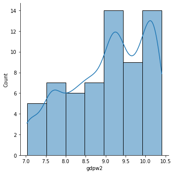
Let’s plot a histogram for the Log of GDP per capita (gdpw2)?
g = sns.displot(data = perisk,
                x = 'gdpw2',
                kind = 'hist',
                kde = True,
                kde_kws = {'bw_adjust': 0.5})
plt.show()
Customizations
We can easily customize the entire plot:
Main title:
plt.title('title here')X-axis title:
g.set_xlabels('text')orplt.xlabel('text')Y-axis title:
g.set_ylabels('text')orplt.ylabel('text')Style: ‘white’, ‘dark’, ‘whitegrid’, ‘darkgrid’, and ‘ticks’. Usage:
sns.set_style('stylename')Remove the spine:
g.despine(left = True)Current Palette + display the palette:
sns.palplot(sns.color_palette())Which palettes:
sns.palettes.SEABORN_PALETTESand to change, useset_palette('palette')Save figure: instead of
plt.show()useplt.savefig('figname.png', transparent = False).Context: set the context between ‘paper’, ‘notebook’, ‘talk’, and ‘poster’. Use
sns.set_context('context here')
There are even more customization that we can do. Please check the seaborn documentation for more details.
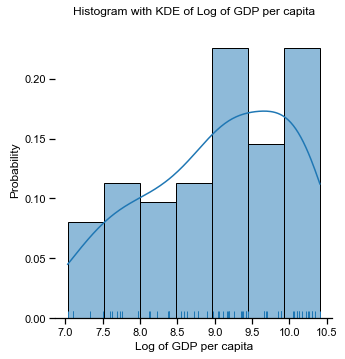
# My code here
sns.set_context('notebook')
g = sns.displot(data = perisk,
                x = 'gdpw2',
                kind = 'hist',
                rug = True,
                kde = True,
                stat = 'probability')
g.despine(left = True)
sns.set_style('dark')
g.set_xlabels('Log of GDP per capita')
plt.title('Histogram with KDE of Log of GDP per capita')
plt.show()
Exercise: Using the histogram, describe the variables totbill and tip in the tips dataset.
## Your code here
Categorical Variables: Countplot
Countplots are suitable for displaying categorical variables.
The syntax is:
sns.catplot(
    data = the_data_frame,
    x = 'the_variable',
    kind = 'count')
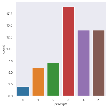
Let’s check the risk of expropriation in each of the countries in 1992.
# My code here
sns.catplot(
    data = perisk,
    x = 'prsexp2',
    kind = 'count')
plt.show()
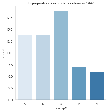
All the customizations that we learn apply here as well. We can use them to prettify this plot.
However, since the scale is out of order, we can change the order of the x-axis values using the order parameter.
Even more, for ordinal data, it is customary to use a sequential color scheme, i.e., it gets darker as we increase the categories.
We can use several palettes:
BluesGreysPuRd: Light Purple to Dark RedGnBu: Light Green to Dark Blue
Among others. The syntax to create the color scheme is:
sns.set_palette(
    sns.color_palette("color_scheme", # If want revert add '_r'
                      [..number_of_colors or as_cmap=True..])
)
For more about color palettes, please check here.
# My code here
sns.set_palette(sns.color_palette("Blues", 6))
sns.set_style('white')
cat_order = [5, 4, 3, 2, 1]
sns.catplot(x = 'prsexp2',
            data = perisk,
            kind = 'count',
            order = cat_order)
plt.title('Expropriation Risk in 62 countries in 1992')
plt.show()
sns.set_palette('colorblind')
Exercise: Do a countplot for the days (day) in the tips dataset.
## Your answer here
Bivariate Plots
Univariate plots are excellent. But in reality, most of the exciting questions in science come from combinations of multiple variables (e.g., cause and effect, correlations, relationships, etc).
For two variables’ plots there are three combinations:
discrete x discrete: mosaic plot
discrete x continuous: several useful types
continuous x continuous: scatterplots
Discrete x Discrete Variables: Mosaicplot
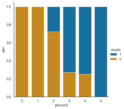
The mosaic plot gives an idea of how the ratio of one variable changes when we change another variable. For instance, one empirical question that we can ask about the perisk dataset is:
Do countries with independent courts have less corruption than countries without independent courts?
The code to test this idea takes two steps. First, we need to prep the data. Then, we plot the data using the kind = 'bar' in the catplot function.
We need to create a table with cumulative values for the two variables we want to study to prep the data. Here is an example of how to do that:
tab = pd.crosstab(df.v1, df.v2, normalize='index') # 1: Crosstab
tab = tab.cumsum(axis = 1).\     # 2: Cummulative sum
      stack().\                  # 3: Stack the results
      reset_index(name = 'dist') # 4: Reset the indexes
tab
Then, we need to plot the results using catplot:
sns.catplot(data = tab,
            x = 'v1', # More variation here
            y = 'dist', # Proportions
            hue = 'v2', # Less variation here
            # Comment hue_order if not displaying well
            hue_order = tab.v2.unique()[::-1],
            dodge = False,
            kind = 'bar')
plt.show()
Full disclosure: A function exists that builds mosaic plots in one line of code. However, I find the results very ugly. You can Google mosaic plot in python and check that yourself.
## Prepping the data
tab = pd.crosstab(perisk.prscorr2, perisk.courts, normalize = 'index')
tab = tab.cumsum(axis = 1).\
      stack().\
      reset_index(name = 'dist')
tab
| prscorr2 | courts | dist | |
|---|---|---|---|
| 0 | 0 | 0 | 1.000000 |
| 1 | 0 | 1 | 1.000000 |
| 2 | 1 | 0 | 1.000000 |
| 3 | 1 | 1 | 1.000000 |
| 4 | 2 | 0 | 0.722222 |
| 5 | 2 | 1 | 1.000000 |
| 6 | 3 | 0 | 0.272727 |
| 7 | 3 | 1 | 1.000000 |
| 8 | 4 | 0 | 0.250000 |
| 9 | 4 | 1 | 1.000000 |
| 10 | 5 | 0 | 0.000000 |
| 11 | 5 | 1 | 1.000000 |
## Doing the plot
sns.catplot(data = tab,
            x = 'prscorr2', # More variation here
            y = 'dist',     # Proportions
            hue = 'courts', # Less variation here
            # Comment here if not displaying well
            hue_order = tab.courts.unique()[::-1],
            dodge = False,
            kind = 'bar',
            legend_out = True)
plt.show()
Exercise: Do the number of smokers (variable smoker) vary by the weekday (day)?
## Your answers here
tips.head()
| totbill | tip | sex | smoker | day | time | size | |
|---|---|---|---|---|---|---|---|
| obs | |||||||
| 1 | 16.99 | 1.01 | F | No | Sun | Night | 2 |
| 2 | 10.34 | 1.66 | M | No | Sun | Night | 3 |
| 3 | 21.01 | 3.50 | M | No | Sun | Night | 3 |
| 4 | 23.68 | 3.31 | M | No | Sun | Night | 2 |
| 5 | 24.59 | 3.61 | F | No | Sun | Night | 4 |
Discrete x Continuous Variables: Boxplots, Swarmplots, Violinplots
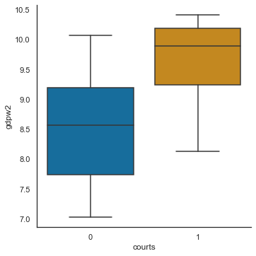
Suppose we want to test whether the data distribution varies based on a categorical variable. For example:
Do you think that having an independent judiciary affects the GDP per capita of a country?
We can check if this hypothesis makes sense by looking into the distribution of GDP per capita and segmenting it by the type of judicial institution.
The syntax for building these plots is almost the same as making a single boxplot. The difference is that you add the categorical variable to one of the axes:
sns.catplot(
    data = data_set,
    x = 'categorical_variable',
    y = 'continuous_variable',
    kind = 'box') # Or 'violin', 'swarm', 'boxen', 'bar'..
# My code here
sns.catplot(x = 'courts',
            y = 'gdpw2',
            data = perisk,
            kind = 'box')
plt.show()
Exercise: Are the tips from smokers higher than tips from non-smokers? (the idea is that smokers would compensate non-smokers for the externality caused) Check that in the tips dataset.
## Your answers here
Continuous x Continuous Variables: Scatterplots and Regplots
To plot two continuous variables, one against the other, we can use two functions. First, we can use the relplot function if we want to explore the relationship without fitting any trend line. The syntax is the following:
sns.relplot(data = data_set,
            x = 'independent_axis_continuous_variable',
            y = 'dependent_axis_continuous_variable',
            hue = 'optional_categorical_to_color',
            kind = 'scatter')
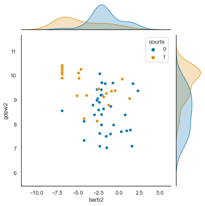
And an excellent version of it, with distribution plots on the top and the left, can be built using the jointplot function:
sns.jointplot(data = data_set,
              x = 'independent_axis_continuous_variable',
              y = 'dependent_axis_continuous_variable',
              hue = 'optional_categorical_to_color',
              kind = 'scatter') # Or 'scatter', 'kde', 'hist', 'hex', 'reg', 'resid'
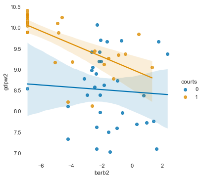
If you want to add a trend line, it is better to use lmplot (instead of ‘reg’ in the plot above). The syntax is the following:
sns.lmplot(data = data_set,
    x = "total_bill",
    y = "tip",
    hue = "smoker",
    logistic = ..False or True.., # Logistic fit for discrete y
    order = ..polynomial order.., # Polynomial degree
    lowess = ..False or True..,   # Lowess fit
    ci = ..None..)                # Remove conf. int.
# My code here
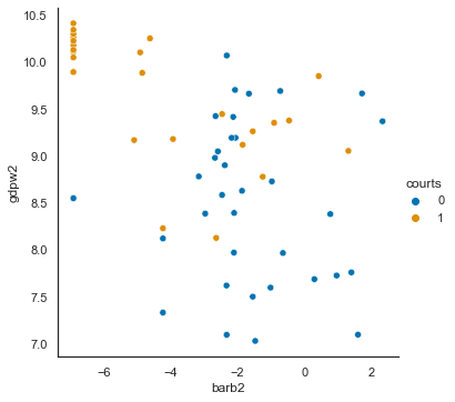
sns.relplot(data = perisk,
x = 'barb2',
y = 'gdpw2',
hue = 'courts',
kind = 'scatter')
plt.show()
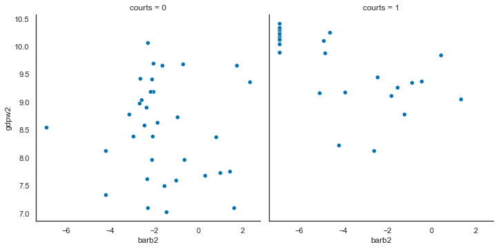
# Or maybe you want to see it in two different plots
sns.relplot(data = perisk,
            x = 'barb2',
            y = 'gdpw2',
            col = 'courts',
            kind = 'scatter')
plt.show()
sns.jointplot(data = perisk,
              x = "barb2",
              y = "gdpw2",
             hue = 'courts')
plt.show()
g = sns.lmplot(data = perisk,
           x = "barb2",
           y = "gdpw2",
           hue = "courts")
g.despine(left = True, bottom = True)
plt.xlim(-7, 3)
plt.show()
Exercise: Are the tips related with total bill in the tips dataset?
## Your answers here
Great job!!!
Extras
Excellent job learning seaborn! It is an easy-to-use yet powerful package to generate lovely plots.
Next, you should take a look at the following packages to keep developing your skills:
plotnine: Implements the ggplot grammar of graphs in pythoncartopy: Package to make maps in python.plotly: Builds interactive graphs in python (and other languages). Check also thedashfor plotly in python.
Now, try the extra exercises below to sharpen your learning.
## Extra Datasets

## Political Information Dataset
# ANES 2000 Political Information based on interviews
# polInf          : Political Information
# collegeDegree   : College Degree
# female          : Female
# age             : Age in years
# homeOwn         : Own house
# others...
polinf = pd.read_csv('https://raw.githubusercontent.com/umbertomig/seabornClass/main/data/pinf.csv')
pinf_order = ['Very Low', 'Fairly Low', 'Average', 'Fairly High', 'Very High']
polinf['polInf'] = pd.Categorical(polinf.polInf,
                                  ordered=True,
                                  categories=pinf_order)

## US Crime data in the 1970's
# Data on violent crime in the US
# Muder: number of murders in the state
# Assault: number of assaults in the state
# others...
usarrests = pd.read_csv('https://raw.githubusercontent.com/umbertomig/seabornClass/main/data/usarrests.csv')
Exercises
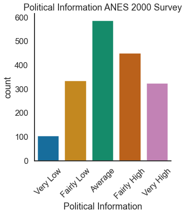
(Univariate) In the
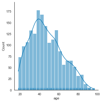
polinfdataset, make a count plot of the variablepolInf. Imagine you want to use this for a talk, so adjust the context. Change the x-axis label and title to appropriate descriptions of the data. (Hint: to rotate the axis tick labels, useplt.xticks(rotation=number_degree_of_your_choice))(Univariate) In the
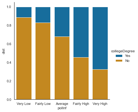
polinfdataset, make a histogram of the variableage. (Hint: set the context back tonotebookbefore starting)(Bivariate) Do you think political information varies with a college degree? Check that using the
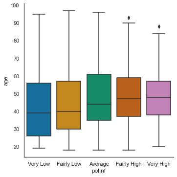
polinfdataset!(Bivariate) Do you think political information varies with age? Check that using the
polinfdataset!(Bivariate) Do you think there is a correlation between
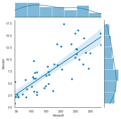
MurderandAssault? Check that using theusarrestsdataset!(Challenge: Multivariate) There are four continuous indicators in the
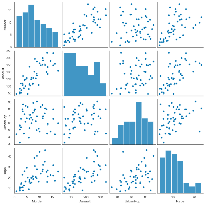
usarrestsdataset:Murder,Assault,UrbanPop, andRape. Do you think you can build a scatterplot matrix? The documentation is in here.
## Your answers here

# 1.
sns.set_context('talk')
g = sns.catplot(data = polinf,
           x = 'polInf',
           kind = 'count')
plt.xlabel('Political Information')
plt.xticks(rotation=45)
plt.title('Political Information ANES 2000 Survey')
plt.show()
# 2.
sns.set_context('notebook')
sns.displot(data = polinf,
           x = 'age',
           kind = 'hist',
           rug = True,
           kde = True)
plt.show()
# 3.
tab = pd.crosstab(polinf.polInf,
                  polinf.collegeDegree,
                  normalize = 'index')
tab = tab.cumsum(axis = 1).stack().reset_index(name = 'dist')
sns.catplot(data = tab,
            x = 'polInf',
            y = 'dist',
            hue = 'collegeDegree',
            hue_order = tab.collegeDegree.unique()[::-1],
            dodge = False,
            kind = 'bar',
            legend_out = True)
plt.show()
# 4.
sns.catplot(data = polinf,
           x = 'polInf',
           y = 'age',
           kind = 'box')
plt.show()
# 5.
sns.jointplot(data = usarrests,
             x = 'Assault',
             y = 'Murder',
             kind = 'reg')
plt.show()
# 6.
sns.pairplot(data = usarrests)
plt.show()